

 Home
HomeFontjoy.com Unveils Guide to Mastering Font Pairing for Web Design
Typography is fundamental to successful design, directly impacting readability and visual appeal. Mastering the art of font pairing is an essential skill for designers at every stage. This in-depth guide demonstrates how to use Fontjoy.com, a robust online tool, to create harmonious font combinations tailored to diverse design projects, with a focus on selecting fonts for headlines, subheadings, and body text.
Key Points
Grasp the critical role of effective font pairing in design work.
Learn to navigate and use Fontjoy.com to generate complementary font sets.
Differentiate between headline, subheading, and body text fonts and their distinct purposes.
Discover methods for fine-tuning contrast and manually choosing fonts.
Apply your chosen font pairings to craft content that is both visually attractive and easy to read.
Ensure web accessibility by choosing and sizing fonts that perform well across various devices and platforms.
Understanding Font Pairing and Its Importance
The Basics of Typography
Typography extends beyond selecting attractive typefaces; it is the craft of arranging type to make written content clear, readable, and visually compelling. Effective typography creates a visual hierarchy, guiding readers through material logically and engagingly. Conversely, poor typography can cause reader fatigue, confusion, and a negative impression of your design. Font choices play a major role in establishing a design's tone and reinforcing its core message.
- Legibility: This refers to how easily individual characters can be distinguished. A highly legible font ensures each letter is clear and unambiguous, preventing misreading.
- Readability: This considers how smoothly text flows in blocks. Elements like line height, letter spacing, and font pairing significantly affect readability.
- Visual Appeal: This involves choosing fonts that complement the overall design aesthetic and contribute to a positive user experience.
Why Font Pairing Matters
Font pairing is a core principle of typography that involves selecting two or more fonts that work together in harmony.
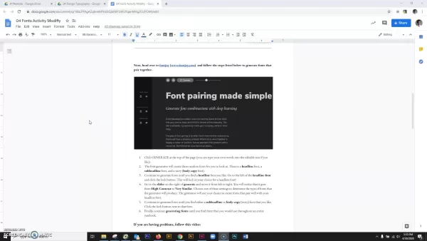
Successful font pairing establishes visual balance, improves readability, and strengthens the design's overall message. Randomly choosing fonts or selecting clashing typefaces can lead to a disjointed and unprofessional look, making it difficult for readers to engage with the content. Effective font pairing considers these key aspects:
- Contrast: Pairing fonts with sufficient contrast ensures each stands out while complementing the others. This can be achieved by combining fonts with different weights, styles, or historical classifications.
- Hierarchy: Using distinct fonts for headlines, subheadings, and body text establishes a clear visual structure, guiding the reader and emphasizing important information.
- Consistency: Maintaining consistent font usage throughout a project creates a cohesive and professional appearance, reinforcing brand identity and user experience.
Fontjoy.com: A Deep Dive
Exploring the Fontjoy.com Interface
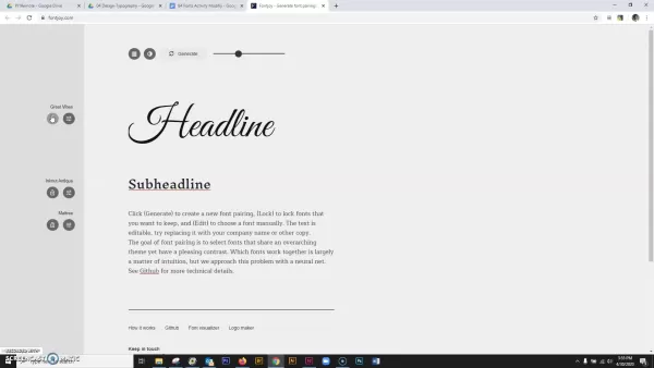
Fontjoy.com is a user-friendly online tool designed to simplify the font pairing process. Its intuitive interface allows designers to generate, customize, and refine font combinations based on specific project needs. Here's a breakdown of the key interface elements:
- Font Selection Area: Displays three fonts simultaneously – intended for headline, subheading, and body text. These are initially chosen randomly but are fully customizable.
- Generate Button: Clicking this button creates a new set of font combinations. The selections adjust based on the current contrast settings.
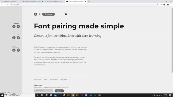
- Lock Icons: Found next to each font name, these icons let you lock fonts you prefer. This keeps them fixed while other fonts are regenerated.
- Edit Options: Provide manual control over font selection, ideal when you have specific typefaces in mind.
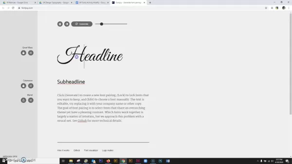
- Contrast Slider: Adjusting this slider changes the visual contrast level between the fonts, with options ranging from 'Very Similar' to 'High Contrast'.
- Light/Dark Mode: This toggle switches the website between light and dark color themes, offering a comfortable viewing experience based on your preference.
Here is a markdown table to summarize the main features:
Feature Description Generate Button Randomly generates font combinations for headline, subheading, and body text. Lock Icons Allows users to lock preferred fonts, preventing them from changing during regeneration. Edit Options Enables manual font selection, providing precise control over each font choice. Contrast Slider Adjusts the visual contrast between the headline, subheading, and body text fonts. Light/Dark Mode Toggles between light and dark website themes for user preference. Font Customization Allows the user to type in their content (headline, subheading, and body copy) and Visualize it with the different font pairings.
Adjusting Contrast for Optimal Harmony
The contrast slider is a pivotal feature in Fontjoy.com for fine-tuning the visual relationship between your chosen fonts.
Using it effectively is key to a successful pairing. Here’s how to leverage this tool:
- High Contrast: Creates a strong visual distinction, making the headline stand out prominently from significantly different subheading and body fonts. Ideal for bold, attention-grabbing designs.
- Balanced Contrast: Offers a safe, versatile middle ground where fonts work well together while maintaining noticeable differences. Suitable for most general purposes.
- Very Similar: Minimizes contrast for a subtle, unified appearance. Useful for creating a cohesive and understated look.
By experimenting with the contrast slider, you can tailor the font pairing to match your design's specific tone and style, ensuring both visual impact and functional clarity.
Step-by-Step Guide to Using Fontjoy.com
Accessing Fontjoy.com
Start by visiting Fontjoy.com in your web browser.
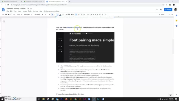
The site's clean and straightforward layout allows you to begin immediately.
Generating Font Combinations
Click the “Generate” button to create an initial set of font pairings.
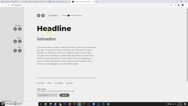
The tool will randomly select fonts for your headline, subheading, and body text.
Customizing Text
Replace the default placeholder text with your actual headline, subheading, and body content. This provides a realistic preview, helping you assess how the fonts will perform in your specific project context.
Locking Desired Fonts
When you find a font you like, click the lock icon next to its name to preserve it. Locking fonts ensures they remain fixed while you generate new combinations for the other type slots, allowing for focused experimentation.
Adjusting Contrast
Use the contrast slider to modify the visual relationship between the fonts. Test different settings to find the optimal balance that enhances both readability and aesthetic appeal.
Manual Font Selection
For precise control, click directly on any font name to manually choose from the available library. This option is perfect when you have specific typeface preferences or requirements.
Evaluating the Results
Critically evaluate the generated pairings. Assess readability, visual harmony, and overall aesthetic fit. Consider how the combination works to convey your intended message and improve the user experience.
Implementing Fonts
Once you've finalized your selections, implement them in your design project. Use the correct font weights, styles, and sizes consistently. For web projects, ensure the fonts are web-friendly and properly integrated for optimal performance and accessibility.
Fontjoy.com: Accessibility and Cost
Fontjoy is Currently Free
Currently, Fontjoy.com offers its complete service free of charge, making it accessible to everyone regardless of budget. This free access provides an excellent resource for designers and creatives seeking effective typography solutions without cost barriers, streamlining the process especially for those still learning.
Advantages and Disadvantages of Fontjoy.com
Pros
Free to use: Fontjoy.com is completely free, making it ideal for users on any budget.
Easy to use: Its user-friendly interface simplifies font pairing for designers at all skill levels.
Time-saving: Quickly generates effective font combinations, reducing time spent on manual research.
Customizable: Offers features like contrast adjustment and manual font selection for greater creative control.
Cons
Limited Font Library: The tool operates with a curated, basic selection of fonts, which may not include more niche or specialized typefaces.
Lack of Advanced Features: It does not include advanced typographic controls for kerning, tracking, or OpenType features.
Reliance on AI: The AI-generated suggestions may not always align with specific or nuanced design visions, requiring careful review.
Key Functionalities of Fontjoy.com
Font Generation and Customization
Fontjoy.com specializes in generating harmonious font pairings to elevate design projects. The tool facilitates customization through options like contrast adjustment and manual selection, empowering designers to find the most effective combination for their project's visual appeal and communication goals.
Practical Applications of Fontjoy.com
Web Design
Fontjoy.com can greatly enhance web design by ensuring typography is both harmonious and readable. The right font pairings improve readability, visual appeal, and overall user experience, leading to more engaging websites. The tool helps maintain visual consistency, reinforcing brand identity. It also aids in selecting web-friendly fonts and appropriate sizing, promoting accessibility by ensuring designs adapt well to different devices and are responsive.
Graphic Design
Fontjoy.com supports achieving visual balance and aesthetic cohesion in graphic design. A well-chosen font pairing sets the tone and reinforces the design's message. The tool helps designers maintain consistency in their typographic choices, ensuring a cohesive and professional final product.
Branding
Fontjoy.com is valuable for establishing and maintaining visual harmony in branding, which contributes to a more compelling identity. Font selection is a powerful visual language in branding, making pairings that reinforce the brand message crucial. Consistency across all marketing materials enhances brand recognition. By simplifying typography decisions, Fontjoy helps align fonts that strengthen the brand's visual narrative.
Frequently Asked Questions
Is Fontjoy.com really free to use?
Yes, Fontjoy.com is currently completely free. It requires no registration or payment to access its font pairing services, making it ideal for designers, students, and anyone aiming to improve their typography without cost. Be aware that the platform may introduce paid features in the future, so checking the official website for the latest information is recommended.
Can I use Fontjoy.com for commercial projects?
Yes, Fontjoy.com can be used for commercial projects. The tool generates font pairings, and the suggested fonts are typically sourced from open-source libraries like Google Fonts, which generally permit commercial use. However, it is essential to verify the specific license for each font you select to ensure it complies with your project's requirements and avoids potential legal issues.
How do I ensure the fonts I select are web-friendly?
To ensure web-friendly fonts, choose from widely supported libraries like Google Fonts, which are optimized for online use and easy to embed. Prioritize web font formats like WOFF or WOFF2 for better performance and compression. Always test your selected fonts across various browsers and devices to guarantee consistent rendering and readability. Also, select appropriate font sizes and line heights to enhance the overall user experience on the web.
Related Questions
What are some common font pairing mistakes to avoid?
Common mistakes include using fonts that are too similar (creating visual monotony), pairing fonts with conflicting moods (disrupting harmony), and neglecting readability (by choosing overly decorative or illegible typefaces). To avoid these, prioritize clear contrast, balanced aesthetics, and legibility. Always test pairings with real content and consider your audience's reading experience, as readability remains the paramount goal in effective design.
How can I improve my typography skills?
Improving typography skills involves mastering the fundamentals, practicing consistently, and staying informed about trends. Study core concepts like font anatomy, kerning, tracking, and leading. Experiment with diverse font combinations and analyze their impact on readability and appeal. Follow design resources, seek feedback, and learn from well-executed designs in websites and publications. Like any craft, typography requires ongoing practice and analysis to develop proficiency.
Related article
 Lenovo Unveils AI Cutie at MWC 2026: Desktop Robotic Arm Becomes Your New Workplace Assistant
If AI in 2025 is still confined to screen-based chats, 2026 marks the shift toward tangible, desk-integrated intelligence. At MWC 2026 in Barcelona, Lenovo unveiled two groundbreaking AI hardware concepts: AI Workmate (an AI Office Partner) and AI Wo
TikTok Launches Voice Copyright Report Channel as AI Clone Voice Complaints Double
TikTok has introduced a dedicated reporting channel for voice-related intellectual property infringement, alongside enhanced rights protection mechanisms. The platform notes that as AI voice synthesis and imitation technologies become more accessible
Is Google AI Overviews safe for SEO? How to use it in 2024
Survivor.io Evo Skills Tier List: The Best and Worst Ranked!Table of Contents:IntroductionWhat is an Evo Skill?Tier List ExplanationC Tier SkillsForce BarrierB Tier SkillsShark Mod GunMagnetic RebounderCaltropsThunderbolt BombInferno BombInquisitor D
Related Special Topic Recommendations
Comic Creation
Lenovo Unveils AI Cutie at MWC 2026: Desktop Robotic Arm Becomes Your New Workplace Assistant
If AI in 2025 is still confined to screen-based chats, 2026 marks the shift toward tangible, desk-integrated intelligence. At MWC 2026 in Barcelona, Lenovo unveiled two groundbreaking AI hardware concepts: AI Workmate (an AI Office Partner) and AI Wo
TikTok Launches Voice Copyright Report Channel as AI Clone Voice Complaints Double
TikTok has introduced a dedicated reporting channel for voice-related intellectual property infringement, alongside enhanced rights protection mechanisms. The platform notes that as AI voice synthesis and imitation technologies become more accessible
Is Google AI Overviews safe for SEO? How to use it in 2024
Survivor.io Evo Skills Tier List: The Best and Worst Ranked!Table of Contents:IntroductionWhat is an Evo Skill?Tier List ExplanationC Tier SkillsForce BarrierB Tier SkillsShark Mod GunMagnetic RebounderCaltropsThunderbolt BombInferno BombInquisitor D
Related Special Topic Recommendations
Comic Creation
 Manga AI Background Generators for Serialized Chapters, Covers, and Promo Art
2026 Latest Best Manga AI Background Generators Ranked Top-Rated! This curated collection showcases powerful game-changing tools perfect for creating high-quality chapter backgrounds, book covers, and promotional art. Every option has undergone rigorous real-world tests to ensure reliability. Get a free vs paid comparison along with detailed insights. Explore now to discover your perfect tool and unlock your AI edge in manga creation.
 6 tools
 xix.ai
Image editing
AI Object Removal Editors: Clean Up Portraits, Travel, and Product Shots
xix.ai
Image editing
AI Object Removal Editors: Clean Up Portraits, Travel, and Product Shots
2026 Latest Best Top-rated AI Object Removal Editors for portraits travel product shots! XIX.AI curates a powerful game-changing collection regularly updated with weekly rankings. These tools offer real-world tests to help you quickly remove unwanted elements, boost content quality, and save tons of time without compromising results. Must-try for anyone aiming to unlock their AI creation edge. Explore now!
10 tools
xix.ai
Text-to-speech
Best AI Text to Speech Tools for Online Courses
2026 Latest Best Top-rated AI Text to Speech Tools for Online Courses are curated by XIX.AI based on rigorous real-world tests and weekly updated rankings. These powerful tools help creators deliver crystal-clear audio content effortlessly, boosting writing efficiency and streamlining course production. Check out the free vs paid comparison to find your perfect fit. Explore now to unlock your AI edge in online education.
10 tools
xix.ai
writing
AI Blog Title Tools for Higher Click Through Rates
2026 Latest Best Top-Rated AI Blog Title Tools for Higher Click Through Rates! XIX.AI has carefully curated a powerful, game-changing collection of top tools that go through rigorous real-world tests. You’ll find a free vs paid comparison, weekly updated rankings, and detailed insights to help you boost your blog’s traffic efficiently. Must-try options are highlighted to help you unlock your AI edge. Explore now!
10 tools
xix.ai
automation
Best AI Task Routing Tools for Support Workflows
2026 Latest Best Top-rated AI Task Routing Tools for Support Workflows! XIX.AI has curated a highly powerful game-changing collection of must-try solutions, all undergoing rigorous real-world tests and updated weekly. These tools streamline workflows, boost productivity, and help teams deliver faster, more efficient support. Explore now to discover your perfect tool and unlock your AI edge!
17 tools
xix.ai
Academic Research
AI Citation and Paper Summary Tools
2026 Latest Best Top-Rated AI Citation and Paper Summary Tools Curated by XIX.AI. Get powerful game-changing solutions for quick content creation, improved writing efficiency, and boosting productivity. We offer a free vs paid comparison along with real-world tests and weekly updated rankings to help you find the must-try tool that fits your needs perfectly. Explore now to Unlock your AI edge.
10 tools
xix.ai

 Comments (1)
0/500
Comments (1)
0/500
![AlbertThomas]()
폰트 조합이 웹 디자인에 정말 중요한데, 항상 어려웠어요. Fontjoy.com가 이런 가이드로 도와준다고 해서 한번 사용해 봐야겠네요. UI가 복잡하지 않으면 좋겠는데... 다른 AI 도구들도 비슷한 기능을 내놓고 있어서 경쟁이 심해질 것 같아요. 일단 기대됩니다! 🔤
Typography is fundamental to successful design, directly impacting readability and visual appeal. Mastering the art of font pairing is an essential skill for designers at every stage. This in-depth guide demonstrates how to use Fontjoy.com, a robust online tool, to create harmonious font combinations tailored to diverse design projects, with a focus on selecting fonts for headlines, subheadings, and body text.
Key Points
Grasp the critical role of effective font pairing in design work.
Learn to navigate and use Fontjoy.com to generate complementary font sets.
Differentiate between headline, subheading, and body text fonts and their distinct purposes.
Discover methods for fine-tuning contrast and manually choosing fonts.
Apply your chosen font pairings to craft content that is both visually attractive and easy to read.
Ensure web accessibility by choosing and sizing fonts that perform well across various devices and platforms.
Understanding Font Pairing and Its Importance
The Basics of Typography
Typography extends beyond selecting attractive typefaces; it is the craft of arranging type to make written content clear, readable, and visually compelling. Effective typography creates a visual hierarchy, guiding readers through material logically and engagingly. Conversely, poor typography can cause reader fatigue, confusion, and a negative impression of your design. Font choices play a major role in establishing a design's tone and reinforcing its core message.
- Legibility: This refers to how easily individual characters can be distinguished. A highly legible font ensures each letter is clear and unambiguous, preventing misreading.
- Readability: This considers how smoothly text flows in blocks. Elements like line height, letter spacing, and font pairing significantly affect readability.
- Visual Appeal: This involves choosing fonts that complement the overall design aesthetic and contribute to a positive user experience.
Why Font Pairing Matters
Font pairing is a core principle of typography that involves selecting two or more fonts that work together in harmony.
Successful font pairing establishes visual balance, improves readability, and strengthens the design's overall message. Randomly choosing fonts or selecting clashing typefaces can lead to a disjointed and unprofessional look, making it difficult for readers to engage with the content. Effective font pairing considers these key aspects:
- Contrast: Pairing fonts with sufficient contrast ensures each stands out while complementing the others. This can be achieved by combining fonts with different weights, styles, or historical classifications.
- Hierarchy: Using distinct fonts for headlines, subheadings, and body text establishes a clear visual structure, guiding the reader and emphasizing important information.
- Consistency: Maintaining consistent font usage throughout a project creates a cohesive and professional appearance, reinforcing brand identity and user experience.
Fontjoy.com: A Deep Dive
Exploring the Fontjoy.com Interface
Fontjoy.com is a user-friendly online tool designed to simplify the font pairing process. Its intuitive interface allows designers to generate, customize, and refine font combinations based on specific project needs. Here's a breakdown of the key interface elements:
- Font Selection Area: Displays three fonts simultaneously – intended for headline, subheading, and body text. These are initially chosen randomly but are fully customizable.
- Generate Button: Clicking this button creates a new set of font combinations. The selections adjust based on the current contrast settings.
- Lock Icons: Found next to each font name, these icons let you lock fonts you prefer. This keeps them fixed while other fonts are regenerated.
- Edit Options: Provide manual control over font selection, ideal when you have specific typefaces in mind.
- Contrast Slider: Adjusting this slider changes the visual contrast level between the fonts, with options ranging from 'Very Similar' to 'High Contrast'.
- Light/Dark Mode: This toggle switches the website between light and dark color themes, offering a comfortable viewing experience based on your preference.
Here is a markdown table to summarize the main features:
| Feature | Description |
|---|---|
| Generate Button | Randomly generates font combinations for headline, subheading, and body text. |
| Lock Icons | Allows users to lock preferred fonts, preventing them from changing during regeneration. |
| Edit Options | Enables manual font selection, providing precise control over each font choice. |
| Contrast Slider | Adjusts the visual contrast between the headline, subheading, and body text fonts. |
| Light/Dark Mode | Toggles between light and dark website themes for user preference. |
| Font Customization | Allows the user to type in their content (headline, subheading, and body copy) and Visualize it with the different font pairings. |
Adjusting Contrast for Optimal Harmony
The contrast slider is a pivotal feature in Fontjoy.com for fine-tuning the visual relationship between your chosen fonts.
Using it effectively is key to a successful pairing. Here’s how to leverage this tool:
- High Contrast: Creates a strong visual distinction, making the headline stand out prominently from significantly different subheading and body fonts. Ideal for bold, attention-grabbing designs.
- Balanced Contrast: Offers a safe, versatile middle ground where fonts work well together while maintaining noticeable differences. Suitable for most general purposes.
- Very Similar: Minimizes contrast for a subtle, unified appearance. Useful for creating a cohesive and understated look.
By experimenting with the contrast slider, you can tailor the font pairing to match your design's specific tone and style, ensuring both visual impact and functional clarity.
Step-by-Step Guide to Using Fontjoy.com
Accessing Fontjoy.com
Start by visiting Fontjoy.com in your web browser.
The site's clean and straightforward layout allows you to begin immediately.
Generating Font Combinations
Click the “Generate” button to create an initial set of font pairings.
The tool will randomly select fonts for your headline, subheading, and body text.
Customizing Text
Replace the default placeholder text with your actual headline, subheading, and body content. This provides a realistic preview, helping you assess how the fonts will perform in your specific project context.
Locking Desired Fonts
When you find a font you like, click the lock icon next to its name to preserve it. Locking fonts ensures they remain fixed while you generate new combinations for the other type slots, allowing for focused experimentation.
Adjusting Contrast
Use the contrast slider to modify the visual relationship between the fonts. Test different settings to find the optimal balance that enhances both readability and aesthetic appeal.
Manual Font Selection
For precise control, click directly on any font name to manually choose from the available library. This option is perfect when you have specific typeface preferences or requirements.
Evaluating the Results
Critically evaluate the generated pairings. Assess readability, visual harmony, and overall aesthetic fit. Consider how the combination works to convey your intended message and improve the user experience.
Implementing Fonts
Once you've finalized your selections, implement them in your design project. Use the correct font weights, styles, and sizes consistently. For web projects, ensure the fonts are web-friendly and properly integrated for optimal performance and accessibility.
Fontjoy.com: Accessibility and Cost
Fontjoy is Currently Free
Currently, Fontjoy.com offers its complete service free of charge, making it accessible to everyone regardless of budget. This free access provides an excellent resource for designers and creatives seeking effective typography solutions without cost barriers, streamlining the process especially for those still learning.
Advantages and Disadvantages of Fontjoy.com
Pros
Free to use: Fontjoy.com is completely free, making it ideal for users on any budget.
Easy to use: Its user-friendly interface simplifies font pairing for designers at all skill levels.
Time-saving: Quickly generates effective font combinations, reducing time spent on manual research.
Customizable: Offers features like contrast adjustment and manual font selection for greater creative control.
Cons
Limited Font Library: The tool operates with a curated, basic selection of fonts, which may not include more niche or specialized typefaces.
Lack of Advanced Features: It does not include advanced typographic controls for kerning, tracking, or OpenType features.
Reliance on AI: The AI-generated suggestions may not always align with specific or nuanced design visions, requiring careful review.
Key Functionalities of Fontjoy.com
Font Generation and Customization
Fontjoy.com specializes in generating harmonious font pairings to elevate design projects. The tool facilitates customization through options like contrast adjustment and manual selection, empowering designers to find the most effective combination for their project's visual appeal and communication goals.
Practical Applications of Fontjoy.com
Web Design
Fontjoy.com can greatly enhance web design by ensuring typography is both harmonious and readable. The right font pairings improve readability, visual appeal, and overall user experience, leading to more engaging websites. The tool helps maintain visual consistency, reinforcing brand identity. It also aids in selecting web-friendly fonts and appropriate sizing, promoting accessibility by ensuring designs adapt well to different devices and are responsive.
Graphic Design
Fontjoy.com supports achieving visual balance and aesthetic cohesion in graphic design. A well-chosen font pairing sets the tone and reinforces the design's message. The tool helps designers maintain consistency in their typographic choices, ensuring a cohesive and professional final product.
Branding
Fontjoy.com is valuable for establishing and maintaining visual harmony in branding, which contributes to a more compelling identity. Font selection is a powerful visual language in branding, making pairings that reinforce the brand message crucial. Consistency across all marketing materials enhances brand recognition. By simplifying typography decisions, Fontjoy helps align fonts that strengthen the brand's visual narrative.
Frequently Asked Questions
Is Fontjoy.com really free to use?
Yes, Fontjoy.com is currently completely free. It requires no registration or payment to access its font pairing services, making it ideal for designers, students, and anyone aiming to improve their typography without cost. Be aware that the platform may introduce paid features in the future, so checking the official website for the latest information is recommended.
Can I use Fontjoy.com for commercial projects?
Yes, Fontjoy.com can be used for commercial projects. The tool generates font pairings, and the suggested fonts are typically sourced from open-source libraries like Google Fonts, which generally permit commercial use. However, it is essential to verify the specific license for each font you select to ensure it complies with your project's requirements and avoids potential legal issues.
How do I ensure the fonts I select are web-friendly?
To ensure web-friendly fonts, choose from widely supported libraries like Google Fonts, which are optimized for online use and easy to embed. Prioritize web font formats like WOFF or WOFF2 for better performance and compression. Always test your selected fonts across various browsers and devices to guarantee consistent rendering and readability. Also, select appropriate font sizes and line heights to enhance the overall user experience on the web.
Related Questions
What are some common font pairing mistakes to avoid?
Common mistakes include using fonts that are too similar (creating visual monotony), pairing fonts with conflicting moods (disrupting harmony), and neglecting readability (by choosing overly decorative or illegible typefaces). To avoid these, prioritize clear contrast, balanced aesthetics, and legibility. Always test pairings with real content and consider your audience's reading experience, as readability remains the paramount goal in effective design.
How can I improve my typography skills?
Improving typography skills involves mastering the fundamentals, practicing consistently, and staying informed about trends. Study core concepts like font anatomy, kerning, tracking, and leading. Experiment with diverse font combinations and analyze their impact on readability and appeal. Follow design resources, seek feedback, and learn from well-executed designs in websites and publications. Like any craft, typography requires ongoing practice and analysis to develop proficiency.








 Lenovo Unveils AI Cutie at MWC 2026: Desktop Robotic Arm Becomes Your New Workplace Assistant
If AI in 2025 is still confined to screen-based chats, 2026 marks the shift toward tangible, desk-integrated intelligence. At MWC 2026 in Barcelona, Lenovo unveiled two groundbreaking AI hardware concepts: AI Workmate (an AI Office Partner) and AI Wo
Lenovo Unveils AI Cutie at MWC 2026: Desktop Robotic Arm Becomes Your New Workplace Assistant
If AI in 2025 is still confined to screen-based chats, 2026 marks the shift toward tangible, desk-integrated intelligence. At MWC 2026 in Barcelona, Lenovo unveiled two groundbreaking AI hardware concepts: AI Workmate (an AI Office Partner) and AI Wo
 TikTok Launches Voice Copyright Report Channel as AI Clone Voice Complaints Double
TikTok has introduced a dedicated reporting channel for voice-related intellectual property infringement, alongside enhanced rights protection mechanisms. The platform notes that as AI voice synthesis and imitation technologies become more accessible
TikTok Launches Voice Copyright Report Channel as AI Clone Voice Complaints Double
TikTok has introduced a dedicated reporting channel for voice-related intellectual property infringement, alongside enhanced rights protection mechanisms. The platform notes that as AI voice synthesis and imitation technologies become more accessible
 Is Google AI Overviews safe for SEO? How to use it in 2024
Survivor.io Evo Skills Tier List: The Best and Worst Ranked!Table of Contents:IntroductionWhat is an Evo Skill?Tier List ExplanationC Tier SkillsForce BarrierB Tier SkillsShark Mod GunMagnetic RebounderCaltropsThunderbolt BombInferno BombInquisitor D
Is Google AI Overviews safe for SEO? How to use it in 2024
Survivor.io Evo Skills Tier List: The Best and Worst Ranked!Table of Contents:IntroductionWhat is an Evo Skill?Tier List ExplanationC Tier SkillsForce BarrierB Tier SkillsShark Mod GunMagnetic RebounderCaltropsThunderbolt BombInferno BombInquisitor D
2026 Latest Best Manga AI Background Generators Ranked Top-Rated! This curated collection showcases powerful game-changing tools perfect for creating high-quality chapter backgrounds, book covers, and promotional art. Every option has undergone rigorous real-world tests to ensure reliability. Get a free vs paid comparison along with detailed insights. Explore now to discover your perfect tool and unlock your AI edge in manga creation.
6 tools
xix.ai
2026 Latest Best Top-rated AI Object Removal Editors for portraits travel product shots! XIX.AI curates a powerful game-changing collection regularly updated with weekly rankings. These tools offer real-world tests to help you quickly remove unwanted elements, boost content quality, and save tons of time without compromising results. Must-try for anyone aiming to unlock their AI creation edge. Explore now!
10 tools
xix.ai
2026 Latest Best Top-rated AI Text to Speech Tools for Online Courses are curated by XIX.AI based on rigorous real-world tests and weekly updated rankings. These powerful tools help creators deliver crystal-clear audio content effortlessly, boosting writing efficiency and streamlining course production. Check out the free vs paid comparison to find your perfect fit. Explore now to unlock your AI edge in online education.
10 tools
xix.ai

2026 Latest Best Top-Rated AI Blog Title Tools for Higher Click Through Rates! XIX.AI has carefully curated a powerful, game-changing collection of top tools that go through rigorous real-world tests. You’ll find a free vs paid comparison, weekly updated rankings, and detailed insights to help you boost your blog’s traffic efficiently. Must-try options are highlighted to help you unlock your AI edge. Explore now!
10 tools
xix.ai

2026 Latest Best Top-rated AI Task Routing Tools for Support Workflows! XIX.AI has curated a highly powerful game-changing collection of must-try solutions, all undergoing rigorous real-world tests and updated weekly. These tools streamline workflows, boost productivity, and help teams deliver faster, more efficient support. Explore now to discover your perfect tool and unlock your AI edge!
17 tools
xix.ai
2026 Latest Best Top-Rated AI Citation and Paper Summary Tools Curated by XIX.AI. Get powerful game-changing solutions for quick content creation, improved writing efficiency, and boosting productivity. We offer a free vs paid comparison along with real-world tests and weekly updated rankings to help you find the must-try tool that fits your needs perfectly. Explore now to Unlock your AI edge.
10 tools
xix.ai

폰트 조합이 웹 디자인에 정말 중요한데, 항상 어려웠어요. Fontjoy.com가 이런 가이드로 도와준다고 해서 한번 사용해 봐야겠네요. UI가 복잡하지 않으면 좋겠는데... 다른 AI 도구들도 비슷한 기능을 내놓고 있어서 경쟁이 심해질 것 같아요. 일단 기대됩니다! 🔤