


 Home
HomeGraphy for Data Storytelling



Helps TikTok sellers, brands, MCNs, and TAPs discover winning products and find creators.

HelpLook is an AI-powered all-in-one knowledge base tool that helps businesses quickly build knowledge bases, help centers, and...

Your AI Workspace

302.AI is an enterprise-grade AI resource platform with pay-as-you-go pricing, API access to a full range of AI models, and ready-to-use online applications.

剧火AI — AI Screenwriter + Director, a One-Person Short Drama Studio In one sentence, what is it?
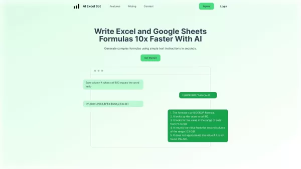
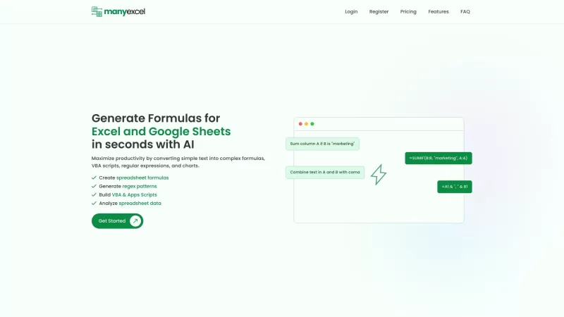
What is AI Excel Bot?AI Excel Bot uses advanced AI algorithms to help you build complex Excel and Google Sheets formulas in seconds. By leveraging natural language processing, it makes writing, editing, and understanding formulas much easier. Whether
What is Bubbly?BubblyAI is a comprehensive platform that transforms data analysis for businesses. By leveraging advanced AI algorithms, it automates extracting actionable insights from complex datasets, empowering users to make confident, data-driven
Ever felt like you're stuck trying to solve complex business issues, but your tech skills just aren't up to snuff? Enter Wand, your new best friend in the world of AI. This tool is designed to be a game-changer, allowing anyone, regardless of their techni
Ever wondered how to keep elections transparent and fair? Meet REVISOR - Your Unblinking Poll Watcher, a cutting-edge software package that leverages the power of neural networks to ensure the integrity of electoral processes. This tool is like having an
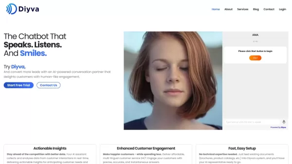
Ever wondered what Diya is all about? Well, let me introduce you to this fantastic AI-powered multilingual virtual assistant that's revolutionizing the way websites interact with their visitors. Diya isn't just any virtual assistant; it comes with a human
Graphy for Data Storytelling Product Information
What is Graphy for Data Storytelling?
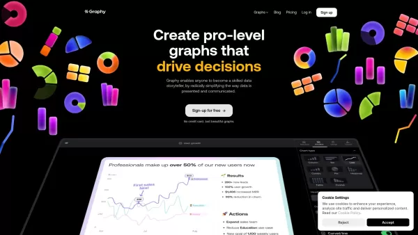
Graphy is a streamlined platform that empowers individuals and teams to create professional graphs effortlessly. It demystifies data visualization, enabling users to unlock actionable insights from their information. With an intuitive interface and robust capabilities—including AI-powered insights, customizable designs, and real-time collaboration—Graphy is essential for anyone who needs to present data clearly and persuasively. It is ideal for presentations, reports, and internal decision-making, ensuring your data narrative is both compelling and easy to understand.
Who will use Graphy for Data Storytelling?
- Data Analysts
- Business Professionals
- Marketing Teams
- Educators and Trainers
- Researchers
How to use the Graphy for Data Storytelling?
- Step 1: Create an account and log into Graphy.
- Step 2: Import or paste your data from sources such as Google Sheets or Excel.
- Step 3: Personalize your graph with themes, color schemes, and annotations.
- Step 4: Work together with teammates in real-time.
- Step 5: Export your graph or embed it directly into reports and presentations.
Platform
- Web
Graphy for Data Storytelling's Core Features & Benefits
The Core Features
- AI-Generated Insights
- Customizable Designs
- Real-Time Collaboration
- Simple Data Import
- Multiple Chart Types
The Benefits
- Simplifies Data Presentation
- Supports Better Decision-Making
- Improves Team Collaboration
- Enhances Data Storytelling
- Saves Time on Visualization Tasks
Graphy for Data Storytelling's Main Use Cases & Applications
- Business Reports
- Marketing Dashboards
- Academic Research
- Sales Presentations
- Internal Data Reviews
Graphy for Data Storytelling's Pros & Cons
The Pros
Simplifies complex data visualization with AI assistance for creating charts and explaining insights.
Highly intuitive and user-friendly interface with no steep learning curve required.
Enables seamless collaboration and sharing across popular platforms to keep teams and stakeholders aligned.
Reportedly creates graphs up to 80% faster than many competing tools.
Produces beautiful, interactive visuals that significantly enhance data storytelling.
The Cons
Lacks open-source availability, which limits customization options and community contributions.
No dedicated mobile apps or browser extensions mentioned, restricting use primarily to the web platform.
Potential over-reliance on AI-generated insights may pose limitations with highly complex or nuanced data contexts.
Graphy for Data Storytelling's Pricing
Has free plan | YES |
|---|---|
Free trial details | |
Pricing model | Freemium |
Is credit card required | No |
Paid from | 12 USD |
Has lifetime plan | No |
Billing frequency | Monthly |
Details of Pricing Plan
Free
0 USD
- Free for all users
- 5 charts
- Share anywhere
- Limited AI usage
Plus
12 USD
- Everything in Free, plus
- Custom brand colors
- Remove watermark
- Unlimited charts
- Full access to AI features
Business
USD
- Everything in Plus, plus
- Dedicated support
- Enhanced privacy controls
Discount:
-40%
For the latest pricing, please visit: https://graphy.app/pricing
FAQs of Graphy for Data Storytelling
What does a pie chart best show?
Pie charts are excellent for illustrating part-to-whole relationships and percentage distributions of a total. They are perfect for visualizing components like market share, budget allocation, or survey results.
Does a pie chart have to equal 100?
Yes, a pie chart should ideally represent 100% as it shows parts of a whole. Graphy automatically converts your data values into percentages for an accurate visual representation.
What is the easiest pie chart maker?
Graphy is the quickest way to generate pie charts. Just paste your data, and you'll get an instantly customizable visualization.
What is better than a pie chart?
Bar charts are better for comparing exact values, while line charts excel at showing trends. However, pie charts remain ideal for displaying proportional relationships. Graphy supports all these chart types for effective data communication.
What is a pie chart with a hole called?
A pie chart with a hollow center is called a donut chart. Graphy makes it simple to create attractive donut charts for your data presentations.
How do you make a pie chart stand out?
Use Graphy to customize labels, add arrows and annotations, adjust color schemes, highlight important segments, and incorporate AI-generated insights to make your pie chart visually striking.
What does a double bar graph help to compare?
Double bar graphs are ideal for comparing two related sets of data, such as current year versus prior year performance, or actual results versus target goals.
What is the difference between a histogram and a double bar graph?
Histograms display frequency distributions using connected bars, while double bar graphs place two distinct datasets side-by-side for direct comparison.
What is another name for a double bar graph?
Double bar graphs are also referred to as grouped bar charts, paired bar charts, or side-by-side bar graphs.
What are double bar graphs best used for?
Double bar graphs are best for tracking performance over time, comparing results against objectives, analyzing A/B tests, or evaluating differences across multiple categories.
Graphy for Data Storytelling Company Information
- Graphy Technologies Ltd.
- https://graphy.app
- http://twitter.com/graphyhq
- https://www.youtube.com/@graphy151
- https://www.instagram.com/graphyhq/
- https://www.tiktok.com/@graphy.app
- https://www.linkedin.com/company/graphyhq/
Graphy for Data Storytelling Screenshot

2026 Latest Best Top-rated AI Object Removal Editors for portraits travel product shots! XIX.AI curates a powerful game-changing collection regularly updated with weekly rankings. These tools offer real-world tests to help you quickly remove unwanted elements, boost content quality, and save tons of time without compromising results. Must-try for anyone aiming to unlock their AI creation edge. Explore now!
 10 tools
 xix.ai

2026 Latest Best Top-rated AI Text to Speech Tools for Online Courses are curated by XIX.AI based on rigorous real-world tests and weekly updated rankings. These powerful tools help creators deliver crystal-clear audio content effortlessly, boosting writing efficiency and streamlining course production. Check out the free vs paid comparison to find your perfect fit. Explore now to unlock your AI edge in online education.
10 tools
xix.ai

2026 Latest Best Top-Rated AI Blog Title Tools for Higher Click Through Rates! XIX.AI has carefully curated a powerful, game-changing collection of top tools that go through rigorous real-world tests. You’ll find a free vs paid comparison, weekly updated rankings, and detailed insights to help you boost your blog’s traffic efficiently. Must-try options are highlighted to help you unlock your AI edge. Explore now!
10 tools
xix.ai

2026 Latest Best Top-rated AI Task Routing Tools for Support Workflows! XIX.AI has curated a highly powerful game-changing collection of must-try solutions, all undergoing rigorous real-world tests and updated weekly. These tools streamline workflows, boost productivity, and help teams deliver faster, more efficient support. Explore now to discover your perfect tool and unlock your AI edge!
17 tools
xix.ai
2026 Latest Best Top-Rated AI Citation and Paper Summary Tools Curated by XIX.AI. Get powerful game-changing solutions for quick content creation, improved writing efficiency, and boosting productivity. We offer a free vs paid comparison along with real-world tests and weekly updated rankings to help you find the must-try tool that fits your needs perfectly. Explore now to Unlock your AI edge.
10 tools
xix.ai

2026 Latest Best Top-Rated AI Productivity Tools for Daily Work! XIX.AI has curated a powerful, game-changing selection based on rigorous weekly updated rankings and real-world tests. You’ll find must-try options that boost writing efficiency, streamline content creation, and help you overcome daily work challenges. Get a free vs paid comparison to find the perfect fit for your needs. Explore now to unlock your AI edge!
9 tools
xix.ai


